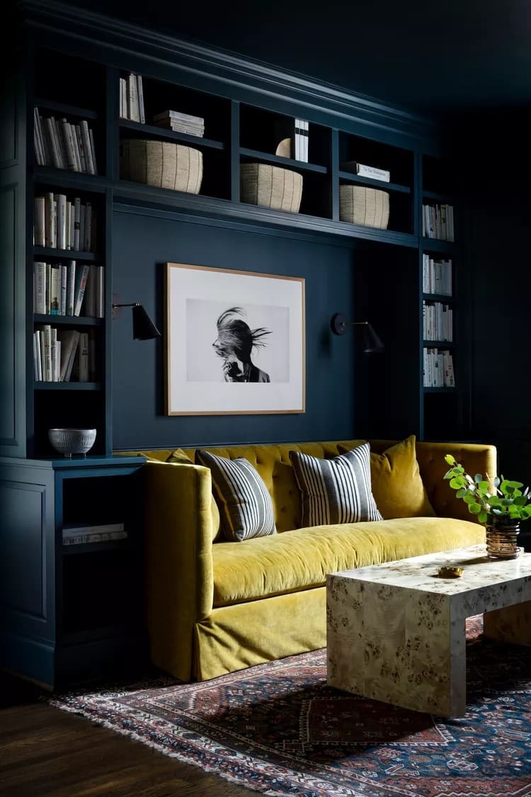
Key Takeaways: Color drenching transforms a room by painting the walls, ceiling, trim, and other surfaces the same color for a cohesive, designer-inspired look. To get it right, choose a shade that complements your existing finishes, test paint samples in different lighting, and mix paint sheens and textures to add depth. Avoid common mistakes like ignoring the ceiling, skipping color tests, or overlooking durability when choosing finishes for high-use surfaces.
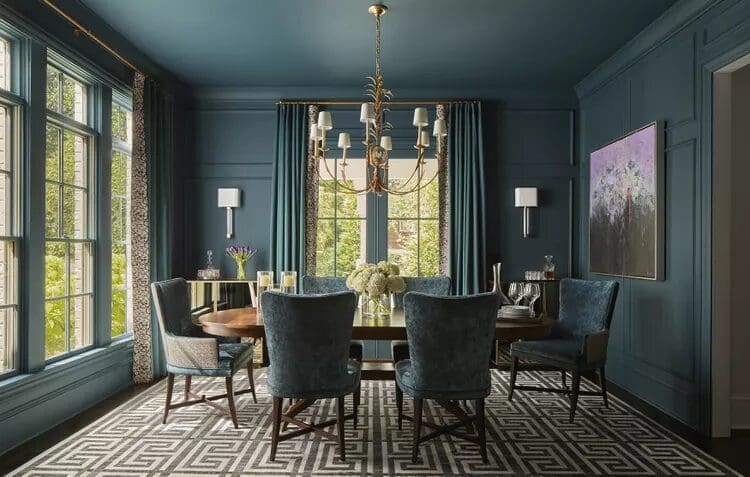
Color drenching is one of those interior design techniques that can make a room feel completely different without changing its layout or replacing its furniture. By carrying one color across the walls, ceiling, trim, and other surfaces, you create a cohesive, immersive look that feels intentional from every angle.
But color drenching involves more than picking a paint color and covering everything in sight. The right shade, paint finish, lighting, and balance of textures can make the difference between a beautifully layered room and a space that feels flat or overwhelming.
Whether you want to create a cozy bedroom, give a small bathroom more personality, or bring a bold new look to your living room, this guide covers everything you need to know about color drenching, including design ideas, practical tips, and common mistakes to avoid.
What Is Color Drenching?
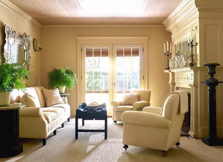
Color drenching is an interior design technique that uses one color across multiple surfaces in a room. Instead of painting only the walls and leaving the ceiling, doors, and trim white, you carry the same color throughout the space to create a unified appearance.
A typical color-drenched room might include:
- Walls and ceilings
- Baseboards, crown molding, and window trim
- Interior doors and door frames
- Built-in cabinets and bookshelves
- Radiators, shelving, and other architectural details
- Selected furniture and decorative elements
The goal is to create an immersive environment where individual surfaces feel connected rather than visually separated.
Color drenching can be as subtle as using a warm off-white across the walls, ceiling, and trim, or as dramatic as painting an entire room deep forest green. The technique works with nearly any color, so the result depends on the atmosphere you want to create.
You also don’t have to use the exact same paint finish everywhere. A matte wall paired with satin-finish trim can introduce subtle contrast while keeping the overall color scheme cohesive.
Ultimately, color drenching is about treating a room as one complete design rather than a collection of separate surfaces.
Color Drenching vs. Monochromatic Design: What’s the Difference?
Color drenching and monochromatic design are closely related, but they aren’t exactly the same thing.
A monochromatic color scheme uses one color family throughout a space. It might combine several shades of blue, for example, with pale blue walls, navy pillows, and a blue-gray rug. The colors coordinate, but different tones, materials, and accents create contrast.
Color drenching focuses more specifically on extending a color across the room’s surfaces and architectural details. The walls, ceiling, doors, and trim might all share the same shade, creating a more enveloping effect.
Here’s a simple comparison:
Monochromatic design: A bedroom with light blue walls, a navy bedspread, blue-gray curtains, and a darker blue accent chair.
Color drenching: A bedroom with blue walls, a blue ceiling, matching blue trim, and a blue-painted door, with bedding and decor adding texture and tonal variation.
You can combine both approaches. A color-drenched room can still include different shades within the same color family through furniture, textiles, and accessories.
The main distinction is that monochromatic design coordinates colors, while color drenching uses color to visually connect the room’s surfaces.
Why Try Color Drenching? 4 Benefits to Consider
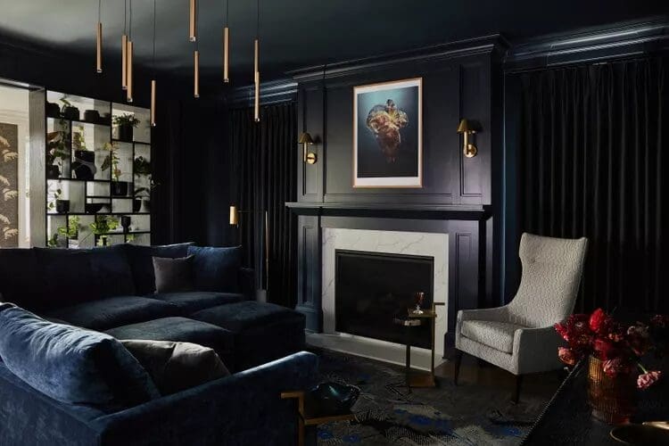
Color drenching is more than a bold paint choice. When thoughtfully planned, it can change how a room feels, highlight architectural features, and make existing elements work together.
Create a Dramatic, Immersive Look
One of the biggest benefits of color drenching is its ability to create a strong visual impact.
A traditional room might use white trim, a white ceiling, and contrasting walls to define each architectural element. Color drenching reduces those visual breaks, allowing the color itself to become the main design feature.
The result doesn’t have to be dramatic in the traditional sense. A room drenched in soft sage, warm beige, or pale blue can feel peaceful and understated. A deeper shade of burgundy, charcoal, or green creates a richer, more intimate atmosphere.
The technique is flexible enough to work with minimalist interiors, traditional homes, and more expressive spaces. It all comes down to choosing a color that supports the mood you want.
Highlight or Camouflage Architectural Details
Color drenching can help you decide which parts of a room deserve attention and which should blend into the background.
Painting crown molding, window frames, doors, and built-in cabinets the same color as the walls creates a more seamless appearance. This can be especially useful when a room has awkward built-ins, prominent radiators, or other functional elements that don’t need to stand out.
On the other hand, using different finishes within the same color scheme can draw attention to architectural details through subtle shifts in light and shadow.
For example, matte green walls paired with satin green trim can highlight the room’s structure without introducing another color.
The key is to think about what you want people to notice when they enter the room.
Make a Small Room Feel More Spacious
It might seem counterintuitive to paint every surface in a small room the same color, but color drenching can actually help a space feel more cohesive.
When the walls, trim, and ceiling have contrasting colors, the eye picks up on the boundaries between each surface. Carrying one color across these areas reduces those visual interruptions and can make the room feel taller or more expansive.
Painting the ceiling the same color as the walls can be particularly effective because it softens the transition between vertical and horizontal surfaces.
However, the goal isn’t always to make a room look bigger. Dark color drenching can make a small room feel cozy, intimate, and dramatic instead. Neither approach is wrong. The best choice depends on the room’s function and the atmosphere you’re trying to create.
Add Personality Without a Major Renovation
Paint is one of the most accessible ways to transform a room without changing its layout or investing in new furniture.
Color drenching can make existing cabinets, shelves, doors, and architectural details feel more intentional. It can also help older features blend into a refreshed design.
If you’re working with a limited budget, consider painting the walls, trim, and ceiling before replacing furniture or purchasing new decor. You may find that a cohesive color scheme gives the room an entirely new personality.
9 Color Drenching Ideas to Inspire Your Home
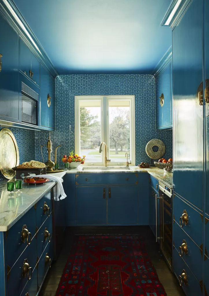
Choosing the right color is one of the most important decisions you’ll make. Think about how you want the room to feel, how much natural light it receives, and which existing finishes you want to complement.
These color drenching ideas offer a starting point for different styles and spaces.
1. Embrace Deep, Moody Colors
Deep colors are a natural fit for color drenching because they create a rich, immersive atmosphere.
Consider forest green, navy blue, burgundy, charcoal, or chocolate brown. When these shades extend across walls, ceilings, and trim, they can make a room feel sophisticated and intimate.
A dark green study with matching bookshelves and trim, for example, can feel like a cozy retreat. A blue-black entryway can create a dramatic first impression, while a chocolate-brown bedroom can feel warm and grounded.
Don’t assume dark colors are reserved for large rooms. They can work beautifully in smaller spaces when the goal is to create atmosphere rather than maximize the feeling of openness.
Balance darker palettes with thoughtful lighting, tactile fabrics, natural wood, or metallic accents to keep the space from feeling one-dimensional.
2. Try Warm Neutrals for a Timeless Look
Color drenching doesn’t have to mean choosing a bold or unexpected color.
Warm neutrals such as cream, beige, taupe, and earthy brown can create a softer version of the trend. These colors bring cohesion to a room without competing with furniture, artwork, or architectural details.
A warm neutral color scheme is particularly useful if you want a calm backdrop that can evolve as your decor changes.
For example, try creamy walls with matching trim and ceilings, then introduce texture through linen curtains, natural wood furniture, woven baskets, and textured upholstery.
The result feels layered without relying on strong color contrasts.
3. Use Soft Blues for a Calming Space
Soft blue, blue-gray, and muted slate can create a peaceful atmosphere that works especially well in bedrooms, home offices, and reading nooks.
Extending a soft blue across the walls, ceiling, doors, and selected furniture creates a cohesive look without feeling overly bold.
Blue-gray can be particularly versatile because it pairs well with warm wood, cream textiles, and natural materials.
If you’re choosing blue for a room with limited natural light, test several shades first. Some blues can appear cooler or grayer depending on the lighting and the colors surrounding them.
4. Bring Nature Indoors With Green
Green is another versatile choice for color drenching because it can feel fresh, calming, earthy, or dramatic depending on the shade.
Sage and muted olive create a relaxed, understated look. Moss and forest green offer more depth, while brighter spring greens can make a room feel lively.
Try a sage-green bedroom with matching trim and a painted ceiling, or use olive green throughout a home office to create a grounded, focused environment.
Green also pairs well with natural materials such as wood, stone, linen, and rattan. These textures add warmth and dimension without disrupting the color scheme.
5. Make a Statement With Yellow or Pink
If you want color drenching to bring more personality into your home, consider warmer shades such as mustard yellow, soft butter yellow, blush, peach, or coral.
Yellow can make a room feel cheerful and energetic, while pink and peach can create anything from a soft, romantic atmosphere to a bold, contemporary statement.
A coral powder room with matching walls and ceiling can feel playful and intentional. A muted peach living room can feel warm without being overwhelming.
The trick is choosing a shade that works with the room’s lighting and existing materials. Strong colors can shift significantly throughout the day, so test samples before committing.
6. Color Drench the Ceiling, Too
If you’re only painting the walls and trim, extending the color onto the ceiling is one of the simplest ways to create a more immersive effect.
A matching ceiling reduces the visual break between the walls and the upper part of the room. This can make a space feel more cohesive and draw the eye upward, especially when the trim and doors are included.
Color drenching the ceiling can also make architectural features such as beams, alcoves, and ceiling details feel like part of the overall design.
For a softer result, use a light neutral across every surface. For something more dramatic, carry a deep green or blue from the walls onto the ceiling.
You don’t have to drench every surface to get started, but including the ceiling often creates the strongest visual effect.
7. Paint the Trim, Doors, and Built-Ins
Matching the trim, doors, and built-ins to the walls is one of the most effective ways to make color drenching feel intentional.
White trim is a familiar choice, but it can create strong visual contrast that interrupts an otherwise cohesive scheme. Painting it the same color as the walls produces a more continuous appearance.
This works particularly well with:
- Built-in bookshelves and cabinetry
- Window frames and door frames
- Baseboards and crown molding
- Interior doors
- Radiators and other functional features
You can use the same color across these surfaces while varying the paint finish to create subtle definition.
Before painting cabinets, radiators, or other specialized surfaces, make sure you choose a compatible primer and finish designed for the material and its intended use.
8. Use Color Drenching to Define a Space
Color drenching can help distinguish different functional areas without adding walls or physical dividers.
This is especially useful in open-plan homes where a living room might also serve as a home office, reading nook, or creative workspace.
For example, paint a desk, shelves, and the wall behind them in the same muted blue-gray. The coordinated color creates a visual zone that feels separate from the rest of the room without interrupting the layout.
You can apply the same idea to a reading corner, built-in dining nook, or small workspace.
In larger open-plan spaces, consider limiting the color to a clearly defined area rather than extending it indiscriminately across every connected surface.
9. Add Texture With Wallpaper and Contrasting Finishes
Using one color across multiple surfaces doesn’t mean everything needs to look exactly the same.
Texture and finish are what help a color-drenched room feel layered rather than flat.
Consider combining matte walls with satin trim, using limewash for a textured finish, or introducing wallpaper with a subtle pattern that complements the surrounding paint color.
You can also add depth through wood grain, linen, velvet, woven materials, and textured plaster.
Another option is double drenching, a more expressive approach that combines two or more bold, coordinated, or contrasting colors across walls, ceilings, trim, and other elements. Instead of relying on a single shade, the design uses multiple colors to create additional depth and visual interest.
Double drenching isn’t necessary for a successful color-drenched room, but it can be worth exploring if you want a more layered, maximalist look.
Which Rooms Work Best for Color Drenching?
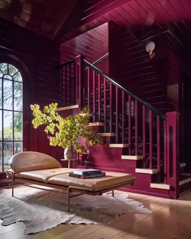
Color drenching can work in almost any room. The best places to start depend on how adventurous you want to be, how the room is used, and which architectural features you want to emphasize.
Bedrooms
Bedrooms are ideal for color drenching because the technique can create a cozy, enveloping environment.
Soft blues, sage greens, warm neutrals, and deeper earthy shades all work well. Consider carrying the color from the walls to the ceiling, trim, and doors for a more immersive result.
You can also paint selected furniture, such as a bedside table or built-in headboard, to make the room feel more cohesive.
To keep the design comfortable rather than overwhelming, introduce contrast through bedding, curtains, natural wood, and soft lighting.
Bathrooms and Powder Rooms
Small bathrooms and powder rooms are excellent places to experiment with color drenching.
A single color across the walls, ceiling, vanity, and trim can make a compact space feel deliberate and visually interesting. Coral, green, blue, and deeper jewel tones can all work depending on the look you want.
You can extend the concept beyond paint by choosing coordinated tiles, colored grout, or wallpaper that complements the surrounding surfaces.
Just make sure the materials are appropriate for the room’s moisture levels. Paint and finishes in bathrooms should be selected for their durability and suitability for humid environments.
Living Rooms
In a living room, color drenching can create a cohesive backdrop for furniture, artwork, and decorative objects.
Warm neutrals can make the room feel understated and relaxed, while deep greens or blues can create a more intimate atmosphere.
Before choosing a shade, consider the flooring, upholstery, window treatments, and amount of natural light. These elements will influence how the finished color reads.
You can also use a color-drenched wall and built-in shelving to create a unified focal point without needing a contrasting accent wall.
Kitchens
Color drenching can give a kitchen a more cohesive appearance by connecting the walls, cabinetry, trim, and selected fixtures through a shared color.
For a subtle look, consider warm neutrals or muted greens. If you want something bolder, try yellow, deep blue, or a rich earthy tone.
You don’t necessarily need to paint every kitchen surface. Start with the cabinets, walls, and trim, then consider how the countertops, backsplash, flooring, and appliances fit into the palette.
Because kitchens experience frequent use, moisture, and grease, choose durable, washable finishes suited to each surface. Cabinet paint and wall paint may need different formulations.
Hallways, Entryways, and Staircases
Transitional spaces are often overlooked, but they’re some of the best places to try color drenching.
A coordinated color scheme can connect different floors, make a narrow hallway feel more intentional, or turn an entryway into a memorable first impression.
Soft blue can create a welcoming atmosphere, while a deep blue-black or forest green can make a foyer feel dramatic.
These spaces can also be ideal for experimenting with a stronger color before using it in a larger room.
Home Offices and Multipurpose Spaces
A color-drenched home office can help define a workspace and create a more focused environment.
Try painting the walls, shelves, desk, and trim in a coordinated shade. Soft blue-gray, muted green, and warm neutrals can work particularly well if you want a calmer background.
In a multipurpose room, use color to establish a distinct zone for working, reading, or relaxing without adding physical partitions.
The result is a space that feels organized while still fitting into the overall design of your home.
How to Color Drench a Room: 6 Steps to Get It Right
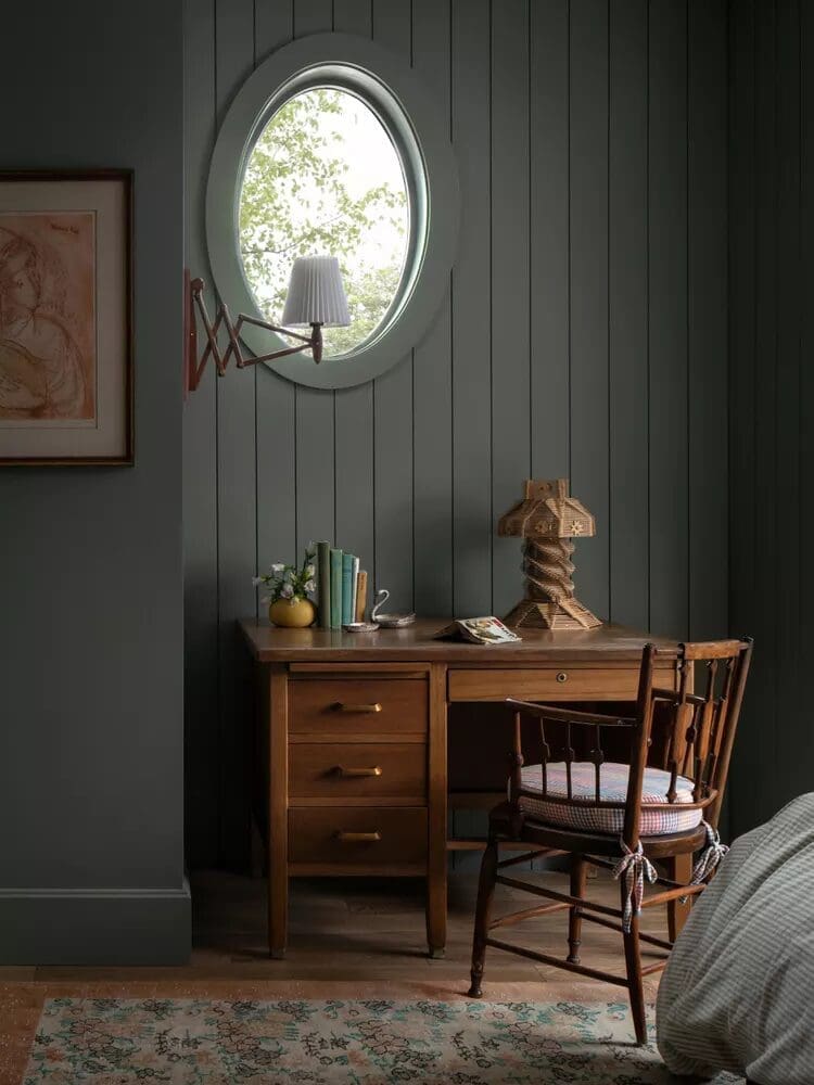
A successful color-drenched room starts with a plan. Before buying paint, think about the atmosphere you want, the surfaces you’ll include, and how the color will interact with the rest of your home.
1. Decide How You Want the Room to Feel
Start with the mood rather than the paint color.
Do you want the room to feel calm, cheerful, cozy, dramatic, or sophisticated? Your answer will help narrow down the colors worth considering.
Soft blues and greens often work well for restful spaces, while warm yellows and peach tones can feel energetic. Deep greens, navy, and burgundy can create a more intimate atmosphere.
Also consider how you use the room. A bedroom may benefit from a softer, more restful palette, while an entryway can be an opportunity to make a stronger statement.
2. Choose a Color That Works With Your Home
Once you have a mood in mind, consider how the color will work with your existing finishes.
Look at your flooring, countertops, furniture, tile, and window treatments. These elements aren’t changing just because you’re painting the room, so the new color needs to work alongside them.
Collect paint samples and test them directly in the space. Look at them in the morning, afternoon, and evening to see how they change with the light.
Don’t rely on a small paint chip alone. A color that looks perfect on a sample card may feel completely different when it covers an entire wall.
3. Decide Which Surfaces to Include
Color drenching is flexible, so you can decide how far to take the technique.
For a subtle approach, paint the walls, trim, and doors the same color. For a more immersive look, include the ceiling, window frames, built-ins, and selected furniture.
Think about which elements you want to blend together and which deserve to stand out.
If your room has beautiful molding or built-in shelving, using the same color across those features can make the architecture feel more cohesive. If you want to emphasize a particular feature, you can introduce contrast through its finish or surrounding decor.
4. Choose the Right Paint Finish
Paint finish influences both the appearance and practicality of a color-drenched room.
Here’s how the most common finishes differ:
- Matte: Creates a soft, low-reflection appearance that works well on walls and ceilings. It can help create a calm, understated look.
- Eggshell: Offers a subtle sheen and is often a practical choice for walls that need a little more cleanability.
- Satin: Reflects more light and can work well on trim, doors, and other surfaces that need added durability.
- Semi-gloss: Has a more noticeable shine and is often used on trim, doors, and certain cabinets or other high-use surfaces.
The exact suitability of each finish depends on the paint product and the surface being coated.
You can use different sheens within the same color scheme to create subtle contrast. For example, matte green walls paired with satin green trim can add dimension without introducing another color.
The goal is to balance appearance with function. A beautiful finish isn’t much help if it can’t handle the wear and cleaning the surface requires.
5. Consider Lighting and Room Proportions
Lighting has a significant effect on how paint colors appear.
A room with abundant natural light may handle a deeper color differently from a room with small windows or limited daylight. Artificial lighting can also make colors appear warmer, cooler, or more muted.
Room proportions matter, too. Extending a color onto the ceiling can create a more unified appearance, while leaving certain surfaces lighter can introduce contrast when that’s part of the intended design.
There isn’t a universal rule that small rooms need light paint or that large rooms can only handle dark colors. Think about the effect you want and test your options before deciding.
6. Layer in Texture and Decor
Once the paint scheme is established, bring in materials that add depth and keep the room from feeling flat.
Wood, linen, wool, stone, metal, and woven textures can all complement a color-drenched space. Artwork and accessories can introduce subtle variations in tone without competing with the overall palette.
For example, a deep green room might include warm wood furniture, cream bedding, textured curtains, and brass accents. A neutral color-drenched living room could use linen upholstery, natural wood, and textured ceramics to create interest.
The color creates cohesion. The materials make the room feel complete.
7 Common Color Drenching Mistakes to Avoid
Color drenching can be a relatively simple way to transform a room, but a few common mistakes can affect the final result. Here’s what to watch for before you start painting.
1. Choosing a Color Without Testing It
A color that looks beautiful online or on a small sample card may look completely different in your home.
Lighting, surrounding materials, and the size of the painted surface can all influence how a shade appears.
Test several options directly in the room and observe them at different times of day. This is especially important when working with bold colors, which can feel much more intense when applied across every surface.
2. Ignoring the Ceiling
If your goal is an immersive, color-drenched look, leaving the ceiling white can interrupt the visual flow.
Painting the ceiling the same color as the walls helps connect the surfaces and can make the room feel more cohesive.
That doesn’t mean every ceiling must match. A contrasting ceiling can be an intentional design choice, especially if you want to preserve a sense of separation or introduce another color.
The important thing is to make the decision deliberately rather than treating the ceiling as an afterthought.
3. Using the Wrong Paint Finish
Using the same flat finish on every surface may create a uniform appearance, but it may not be the most practical choice.
Walls, ceilings, trim, doors, and cabinets have different functional needs. Some surfaces require more durability or easier cleaning, while others benefit from a softer, less reflective finish.
Consider how each surface will be used before selecting your paint. You can maintain a cohesive color scheme while choosing different finishes for appearance and performance.
4. Forgetting About Existing Materials
Paint doesn’t exist in isolation.
Your flooring, countertops, tile, cabinetry, and furniture will influence how the finished color scheme looks. A shade that seems perfect by itself may clash with the undertones of your existing materials.
Before committing, compare paint samples with the finishes that will remain in the room. Look at the combination as a whole rather than evaluating each element separately.
You don’t need everything to match exactly. You just need the colors and materials to work together.
5. Assuming Dark Colors Always Make Rooms Feel Smaller
Dark paint can create a cozy, intimate atmosphere, but that doesn’t automatically mean it will make a room feel cramped.
Color drenching reduces visual breaks between surfaces, which can help a space feel more cohesive even when the color is deep.
The more important question is what you want the room to accomplish. If your priority is a light, airy atmosphere, a lighter shade may be the better choice. If you want a dramatic bedroom or a rich entryway, a dark color may be exactly what the space needs.
Consider the lighting, furnishings, and overall design before ruling out a shade simply because it’s dark.
6. Overlooking Open-Plan Layouts
Color drenching can work beautifully in open-plan homes, but applying one color across a large, connected area requires more planning.
Without clear transitions, the color can feel overwhelming or make different functional areas blend together when you want them to feel distinct.
Consider limiting color drenching to a defined zone, such as a home office, dining nook, or built-in seating area. Color blocking can also help distinguish one area from another while keeping the overall palette coordinated.
The goal is to create visual flow without losing the purpose of each space.
7. Forgetting Texture and Visual Balance
Using one color across multiple surfaces can create a cohesive room, but it can also feel flat if every material has the same appearance.
Texture, sheen, furniture, and decorative elements help create depth.
Combine smooth painted surfaces with natural wood, textured fabrics, stone, or woven accessories. Vary the finishes where appropriate, and consider using artwork or furnishings to introduce contrast.
Remember that color drenching doesn’t require every object to match. The technique works best when the main surfaces feel connected while the rest of the room adds personality.
Remember that color drenching doesn’t require every object to match. The technique works best when the main surfaces feel connected while the rest of the room adds personality.
Color Drenching Do’s and Don’ts
If you’re planning a color-drenched room, keep these guidelines in mind.
Do:
- Test several paint colors in the actual room before committing.
- Consider walls, ceilings, trim, doors, and built-ins as part of one design.
- Use different paint finishes to add subtle contrast and dimension.
- Coordinate your paint color with existing flooring, furniture, and fixed finishes.
- Choose finishes that suit the function of each surface.
- Use texture and materials to create visual interest.
Don’t:
- Assume that only bold or dark colors work for color drenching.
- Leave the ceiling out without considering how it affects the overall look.
- Choose a paint finish based on appearance alone.
- Ignore how lighting changes the way a color looks.
- Force the same color into every connected space if the layout needs clearer definition.
- Assume every piece of furniture and decor must match the walls.
The best color-drenched rooms balance cohesion with contrast. The surfaces work together, but the space still feels layered and livable.
Is Color Drenching Right for Your Home?
Color drenching can work for almost any design style, from understated and neutral to bold and expressive. Whether it’s right for your home depends on the atmosphere you want and how you approach the color scheme.
If you prefer a calm, cohesive interior, try warm neutrals, muted blues, or soft greens across the walls, ceiling, and trim. If you want something more dramatic, explore deeper colors and extend them across additional surfaces.
You also don’t have to commit to an entire living room right away. A powder room, hallway, bedroom, or home office can be a great place to experiment with the technique before introducing it elsewhere.
Most importantly, remember that color drenching is a design tool, not a strict set of rules. You can adapt it to your space, your budget, and your personal style.
When you choose the color intentionally, consider the lighting, and balance the paint with texture and finishes, even a simple paint project can make a room feel thoughtfully designed.
Frequently Asked Questions About Color Drenching
Does color drenching make a room look bigger?
It can. Painting the walls, trim, and ceiling the same color reduces visual breaks and can make a room feel more cohesive or taller. The effect depends on the color, lighting, and room proportions. Darker shades may create a more intimate atmosphere instead.
Can you color drench a small room?
Yes. Small rooms, including powder rooms, hallways, and home offices, can be excellent candidates for color drenching. A consistent color across the walls, ceiling, and trim can help the space feel intentional and visually unified. Choose a lighter shade for a softer look or a deeper color for a cozy, dramatic effect.
Should the ceiling be the same color as the walls?
For a fully immersive color-drenched look, painting the ceiling the same color as the walls is a good starting point. It creates a seamless transition between surfaces. However, leaving the ceiling a different color can also work if you want more contrast or a less enveloping effect.
What colors work best for color drenching?
Almost any color can work. Warm neutrals create a subtle, timeless look, while blues and greens can feel calming or grounded. Yellow and pink bring warmth and personality, while navy, forest green, burgundy, and charcoal create a richer, more dramatic atmosphere. The best color depends on your desired mood, lighting, and existing finishes.
Can you color drench with dark colors?
Absolutely. Dark colors can create depth, sophistication, and a cozy atmosphere. They aren’t automatically unsuitable for small rooms, either. Consider the room’s lighting, the finishes around it, and whether you want the space to feel airy or intimate before choosing a shade.
Do the trim and doors need to match the walls?
They don’t have to, but matching the trim and doors to the walls is one of the easiest ways to achieve the characteristic color-drenched look. It reduces visual contrast and makes the room feel more cohesive. You can still vary the paint finish to create subtle definition.
Can you color drench with wallpaper?
Yes. Wallpaper can complement color drenching by adding pattern and texture to the scheme. You might use wallpaper on one surface and coordinate the paint on surrounding walls, trim, and ceiling. Some designs also extend wallpaper onto the ceiling for a more immersive effect.
What is double drenching?
Double drenching is a more expressive approach that uses multiple bold, coordinated, or contrasting colors across a room’s walls, ceilings, trim, and other elements. Rather than relying on one main color, the technique introduces additional colors to create depth and a more layered visual effect.
How to Make Color Drenching Work for You
Color drenching is a versatile way to transform your home through paint. It can make a room feel calmer, more dramatic, more cohesive, or more personal, depending on the colors and surfaces you choose.
The secret isn’t simply painting everything the same shade. It’s understanding how color, lighting, finishes, architectural details, and texture work together to create a complete space.
Start with the mood you want to create, test your paint colors, and think carefully about which surfaces to include. Whether you choose soft neutrals or a bold, saturated color, a thoughtful approach can make the result feel intentional rather than overwhelming.
At Atipical Design Co, we believe good design starts with understanding how a space should look, feel, and function. If you’re ready to refresh your home but aren’t sure how to bring your ideas together, professional design guidance can help you choose a direction that feels right for your space and your goals.
📲 Call or text 407-279-0448
📧 Email info@atipicaldesignco.com
🌐 Visit www.atipicaldesignco.com to start your Orlando home-staging journey.
- Fall Room Ideas: 15 Easy Ways to Make Your Home Feel Cozy for Autumn
 Key Takeaways: Fall room ideas don’t have to mean covering your home in pumpkins and orange. Start with warm colors, cozy textures, soft lighting, natural elements, and a few seasonal swaps to make every room feel inviting for autumn. There’s something about fall that makes you want your home to… Read more: Fall Room Ideas: 15 Easy Ways to Make Your Home Feel Cozy for Autumn
- Why Do Interior Designers Cost So Much? The True Value of Interior Design
 It’s one of the most common questions homeowners and business owners ask when beginning a design project: Why do interior designers cost so much? At first glance, interior design can seem expensive. When people think about hiring an interior designer, they often picture selecting paint colors, choosing furniture, and styling… Read more: Why Do Interior Designers Cost So Much? The True Value of Interior Design
- 5 Trendy Ways to Use Texture in 2026 Interior Design
 If a space feels flat, it’s usually not the furniture. It’s the lack of texture. In 2026 interior design, texture is doing most of the work. It’s what makes a room feel layered, finished, and easy to connect with Here are 5 trendy ways to use texture in 2026 that… Read more: 5 Trendy Ways to Use Texture in 2026 Interior Design
- How to Find Your Interior Design Style (Step-by-Step Guide)
 If you’ve ever saved a dozen different home photos and thought, “Why do I like all of these?”—you’re not alone. Learning how to find your interior design style isn’t about fitting into one category. It’s about creating a home that feels like you. At Atipical Design Co., we help clients… Read more: How to Find Your Interior Design Style (Step-by-Step Guide)
Leave your thoughts: